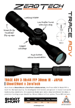
This is my point. I don't care what's on it one because it doesn't really matter and two I can cover it faster than I can make this reply.The whole conversation around what color and what the logo should look like is hilarious.
Sounds real reminiscent of ads occasionally seen looking for optics “wtb silver scope so it matches my barrel. Not fussy on brand or power”…
I could not care any less of what color the entire scope is, as long as it works.
Lazer engrave a big pink dick on the side and name it the Meat Pounder for all I care, if it works as advertised in the package promised then does it really matter what color the font is?!?!?!
Navigation
Install the app
How to install the app on iOS
Follow along with the video below to see how to install our site as a web app on your home screen.
Note: This feature may not be available in some browsers.
More options
Style variation
You are using an out of date browser. It may not display this or other websites correctly.
You should upgrade or use an alternative browser.
You should upgrade or use an alternative browser.
Would you buy this scope?
- Thread starter Ryan Avery
- Start date
RockAndSage
WKR
Lazer engrave a big pink dick on the side and name it the Meat Pounder for all I care, if it works as advertised in the package promised then does it really matter what color the font is?!?!?!
Dude, quit talking about your Prime Ministers - they don't work as advertised, anyhow.
Listen, joking aside - for those the issue matters to, it matters. For those it doesn't, it won't matter no matter how the conversation goes. We're voicing our preferences, as part of the market. A billboard of garish color will detract from our enjoyment and appreciation of these items we invest in. Not their utility. But it matters. And there's a pretty reasonable and wide window of what tasteful means. Big and garish is not it. Those who want big and garish can also pick up a paint pen and treat it like a toilet stall, pink big d*cks and all.
RockAndSage
WKR
I'm fine with all of it being left off
Nobody's asking for this.
I just don't want such a special scope, that I expect to spend several thousand dollars in acquiring examples of, to have the equivalent of purple hair and a nose ring begging for attention and approval.
Separate but related - look at all the major, quality optics brands. None of them have a giant logo on the bell. It's all tasteful symbols or font on the turrets or the ocular.
Go look.
Nightforce, Schmidt & Bender, Swarovski, Leupold, Leica, Vortex even - none of them have garish branding like that.
If someone doesn't think a giant logo on the bell will negatively impact perceived quality of that optic, they don't understand branding or people. It matters.
Marketing is not easy. And it's full of pitfalls. And it matters.
None of them have a giant logo on the bell. It's all tasteful symbols or font on the turrets or the ocular.
Leica and March both do.
RockAndSage
WKR
Leica and March both do.
I'll concede on March - and point out that an exception doesn't invalidate the rule or the utility other vastly more experienced scope brands have found in not treating their scopes like billboards. Leica's symbols on its optics though, even if on the bell, are the small, tasteful dot logo. Even Leupold just does the gold ring - tastefully.
HuntHarder
WKR
And GHEYYYYYYY!I think the orange branding makes the scope look gaudy.
Brandon.miller.4
WKR
- Joined
- May 26, 2020
- Messages
- 826
Ill toss in my .02. I agree that s2h should get credit for this scope. I also agree that the most tasteful branding is small in simple (think NF of nightforce). Anyone in the scope industru instantly recognizes it and associates with quality. Above all id love to see this scope take over the market. I couldn't care less if it was big and gaudy but im unashamedly utilitarian. The vast majority of the public do not see it the same way. Many people DO care what it looks like. I think a classy S2H of some sort would be a great compromise and let the box it comes in tell the story.
Choupique
WKR
- Joined
- Oct 2, 2022
- Messages
- 1,345
Maybe im not actually as sure of my sexuality as I think i am, but if it gets a big pink pecker engraved on it, I aint buying it. Yall can have that one.
If you're going to quote me quote all of it please. It does not matter to me. I'm not petty enough to care how they want to label it as long as it works.Nobody's asking for this.
I just don't want such a special scope, that I expect to spend several thousand dollars in acquiring examples of, to have the equivalent of purple hair and a nose ring begging for attention and approval.
Separate but related - look at all the major, quality optics brands. None of them have a giant logo on the bell. It's all tasteful symbols or font on the turrets or the ocular.
Go look.
Nightforce, Schmidt & Bender, Swarovski, Leupold, Leica, Vortex even - none of them have garish branding like that.
If someone doesn't think a giant logo on the bell will negatively impact perceived quality of that optic, they don't understand branding or people. It matters.
Marketing is not easy. And it's full of pitfalls. And it matters.
again I don't need someone that feels the need to to type out paragraphs to cherry pick half a dozen of my words. I don't care what's on it or not on it.Nobody's asking for this.
I just don't want such a special scope, that I expect to spend several thousand dollars in acquiring examples of, to have the equivalent of purple hair and a nose ring begging for attention and approval.
Separate but related - look at all the major, quality optics brands. None of them have a giant logo on the bell. It's all tasteful symbols or font on the turrets or the ocular.
Go look.
Nightforce, Schmidt & Bender, Swarovski, Leupold, Leica, Vortex even - none of them have garish branding like that.
If someone doesn't think a giant logo on the bell will negatively impact perceived quality of that optic, they don't understand branding or people. It matters.
Marketing is not easy. And it's full of pitfalls. And it matters.
Shoot2Hunt is a great name for a podcast. It’s a terrible name for a line of optics. I buy a lot of stuff, so I should know (grin.)
Call your scope something else. Avoid using numbers for words, x’s instead of s’s, and other clever ideas. And don’t paint yourselves into a corner with the first one. If it’s good, you’ll end up selling a bunch more and you’ll need a good naming system.
Also, Don, that’s big?
Call your scope something else. Avoid using numbers for words, x’s instead of s’s, and other clever ideas. And don’t paint yourselves into a corner with the first one. If it’s good, you’ll end up selling a bunch more and you’ll need a good naming system.
Also, Don, that’s big?
Jason Snyder
WKR
Can we please not dilute this thread with arguments about dildos?
Appears it will be part of an already named line of scopesShoot2Hunt is a great name for a podcast. It’s a terrible name for a line of optics. I buy a lot of stuff, so I should know (grin.)
Call your scope something else. Avoid using numbers for words, x’s instead of s’s, and other clever ideas. And don’t paint yourselves into a corner with the first one. If it’s good, you’ll end up selling a bunch more and you’ll need a good naming system.
Also, Don, that’s big?
NDHUNTER24
Lil-Rokslider
I'm still going to go with the THLR, but do we have any up close reticle pics of the RMG-H to share?
KHntr
WKR
I already named it.Call your scope something else.
The MEAT POUNDER.
Oh I missed it by 20 pages.Appears it will be part of an already named line of scopes
Zero Tech Trace ain’t bad. 5 years from now a dude will be selling a ZT Trace in the optics classifieds with the disclaimer “this is one of the old models with the Shoot2Hunt logo on it, but it tracks and holds zero…”
Similar threads
Featured Video
Latest Articles
- Spartan SpringBok Bipod Review
- All About Pronghorn & Hunting Big Ones with Chance Marshall
- Bill Vanderheyden Debunks Myths About Long-Distance Accuracy
- What Do Elk Eat? Elk Nutrition, Habitat, and Finding More Elk with Luke Schultz
- Patagonia Nano Air Ultralight Hoody Review
- CWD: Progress and Hope in Wyoming?
- Zeiss Conquest Apia 20-50×65 Spotting Scope Review
- What does 2026 hold for Wyoming’s Mule Deer hunters?
- Mathews ARC Bow Review
- What the Mule Deer Conservation Strategy Reveals About Wyoming’s Future

