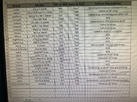
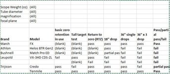
I think anything that makes information more readily available to people is a great idea, and I support some sort of executive summary or this chart.
I am not being argumentative, I'm just sensitive to a couple of points. First, any summary is going to be inadequate in some respects, as it is less than all of the information. Second, a summary that is too exhaustive can become cumbersome. (If you have read
The Checklist Manifesto, a similar point was made therein - checklists must be short enough to be helpful.) Third, this chart (or whatever) involves additional work (but if you or someone else will do it, this is a moot point.)
I dont think that works nearly as well. To me, the additional detail is stuff like differentiating between "passed all tests excepted shifted 1.25moa on 3x36" drops" versus "failed all drops, failed at holding zero". Both of these are a "fail" I believe, but there is a wide range of difference between them that is missed without the nuance...but including that in a chart is perhaps 4 or 5 extra columns allowing you to quickly and easily compare all scopes tested at a time (and possibly filter by weight or magnification, price, etc), versus a 100-page read-a-thon to ferret out information where you dont even know what you are looking for.
The above are all good points. But those additional 4-5 columns may be useful to you, but not everyone. To me, for example, I don't care about the nuance of any failures. I do care about the details of a pass, and in some instances would want the information you describe. In such an instance, I would prefer to read that test, and only that test.
My recollection of most of the tests that I have read is that they are pretty short when you skip over the recitation of the methodology. The Q&A can, however, run long. (A Vortex thread is at 29 pages.) I discount much of that anyways, at least in comparison to the test.
The other thing I think a "form" like this sheet does (see what I did there?), is it forces a consistent format and an answer to a specific question. When I read some of the evals, as thorough as they are, they were written over a multi-year time period without a consistent order, and in text form--even re-reading some I have a hard time saying definitively in a couple cases if its a pass or a fail of a certain part of the test. I think having a form like this actually improves the consistency and rigor of the test itself.
Nice pun.
I'm with you on all of these points. The number of tests has increased, as well as (I believe) the number of people reading them. I am fine with coming up with a method (or methods) to try to provide and summarize the information in a more uniform manner. I expect that Form and Ryan may have thoughts on how they think the information is best presented. And maybe the presentation can help them in making some aspects of the test easier to administer or record.
I don't think we are talking about mutually exclusive summary content. Maybe it's like a hierarchy of weblinks, with it being something like:
- Super Dumbed Down for fwafwow - list of manufacturers, and maybe scope models, and just "pass/fail"
- Linked to any of the above is more detail - and not necessarily the full test link, but some of the items you reference above (and more nested therein).
- Repeat.


