Alert Menu Color

Joined
Nov 5, 2023
Messages
575
Location
Eastern Idaho
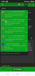
Wondering if it's just me or has the alert menu color changed. The bright green with green name and title makes it really hard to read and I've got great vision and I'm only 40 so I dont need glasses. Is anyone else having issue with this?

Pic attached of what I see.
 

Attachments

  • Screenshot_20250224_154028_Chrome.jpg
    Screenshot_20250224_154028_Chrome.jpg
    109.1 KB · Views: 24
You can change it to the default style, paintbrush icon at the bottom left of the screen if you scroll all the way down
I like the dark color of the forum the green on black is nice on the eyes and the default is white. I've had the dark background with the green since I was a new member but the alert menu was never green on green and this horrible until yesterday.
 
Mine reverts to the way it was up until 2 days ago but only after I click on the post from the ad menu and open it. It's awful the green on green.

The black with green letter is the way it was before.
 

Attachments

  • Screenshot_20250224_193949_Chrome.jpg
    Screenshot_20250224_193949_Chrome.jpg
    122.8 KB · Views: 5
Found a work around. Hit the alert bell and it pulls everything up. Scroll to the very bottom and then hit (mark read) and the green crap goes away and you can actually read it.
 
Just checked mine and it’s now green and white lettering on a black background.
Thanks to whoever made the fix. A lot better than the green on green.
 
Just to tack onto this one. When someone posts a link, it shows up black. It’s really hard to see against the dark theme.

65EBD833-8553-455C-A1F0-9576E3CDD107.png
 
Back
Top