 Unraveling the Mystery of Point Creep
I am an Engineer with a lifelong passion for mule deer hunting. After graduating from school and joining the Rokslide community a few years ago, I have become very serious about my preference point strategies and planning for my “dream hunt.” Every serious mule deer hunter inevitably becomes aware of the expression “point creep.” It is a topic that crops up every year in the hunting community, particularly in the winter months leading up to application deadlines. This day and age, it brings up the questions: Is the point game worth playing? Am I too late to the party? Is point creep even real? These are valid questions and should be taken into consideration when developing long term preference point strategies. As I have been developing and contemplating my own preference point strategies, I quickly realized I needed to establish for myself (through data) that point creep is in fact real and not internet conjecture.
What Is Point Creep?
Given my professional background, I decided to perform some analysis on the data myself. First and foremost, I have found the most common definition of point creep:
- Point Creep – Increase in the amount of preference points required to draw a specific tag over time
To make sure we are all on the same page, let’s look at an example of point creep: Assume a unit required 1 point to draw a tag in 2015. And the same tag required 2 points in 2017 and then 5 points in 2020. Most experienced hunters dealing with the preference point system have seen a scenario like this at some point in their hunting career, but does it really prove point creep beyond anecdotal evidence? So I revved up my computer, grabbed my engineering software, and took a stab at decoding the mystery of point creep.
The Data & Analysis
For my initial dive into investigating point creep, I opted to narrow the focus to a nonresident perspective on mule deer in the state of Colorado. With Colorado’s status as a true preference point state and mule deer tags set as draw-only, this sector promised to provide some of the most interesting results.
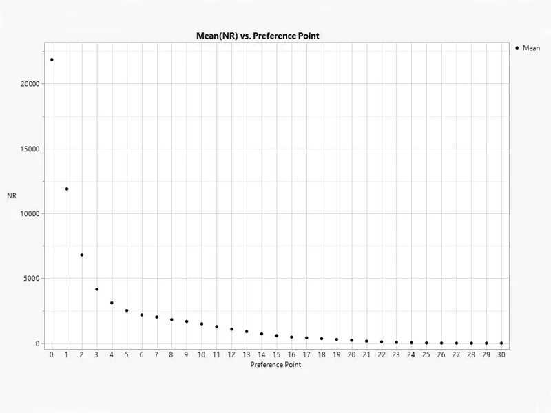
I began my analysis by collecting statistics on nonresident pre-draw applications as well as data on a handful of specific units in Colorado between 2015 and 2020. This information was then averaged and plotted to provide a clear illustration of the point distribution among these nonresidents (see Figure 1). The data demonstrated that most hunters in this group between 2015 and 2020 had 3 or fewer points. The vast minority of nonresident pre-draw applicants had 15 or more points. This general trend was as expected and demonstrates that most nonresidents hold only a handful of points.
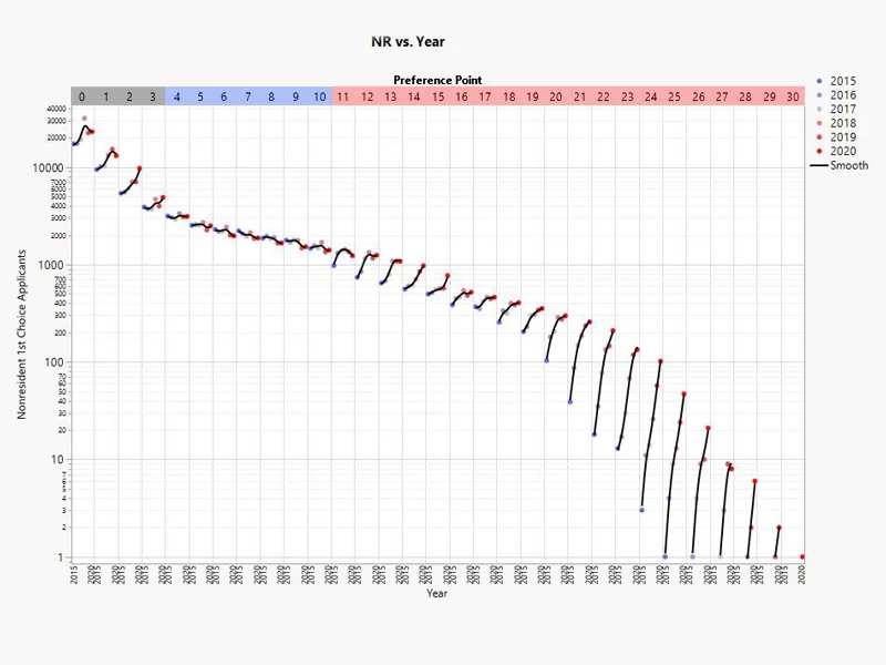
Next, I further broke this data down by plotting the number of applicants per year grouped by their number of preference points (see Figure 2). By no longer averaging the years like in Figure 1, we are able to now see black trend lines forming in each preference point grouping. These lines have a noticeable trend grouping:
- General Upward Trend: approximately 0-3 preference points and 11-18 preference points
- Steep Upward Trend: approximately 19 and more preference points
- General Flat or Downward Trend: approximately 4-10 preference points
These trends would suggest that, on a statewide level, point creep is in fact real and dramatically affecting the high end of the distribution (those with approximately 19 or more points) of the pre-draw nonresident applicants examined. A specific illustration of this can be found in examining the group of applicants with 20 preference points where, between 2015 and 2020, the number of nonresidents with this number of points tripled. However, this graph also highlights an interesting “sweet spot” for hunters in this group with 4-10 preference points where the number of applicants between 2015 and 2020 was quite stable.
Digging Into The Data
Taking things a step further, I took on a more in-depth level of analysis by adding the data I had collected on a handful of specific units to the applicant data we have already examined. This was accomplished by taking three of these units at random and looking at them each in a specific preference point range (0-3 points, 4-10 points, and 19 and more points). For simplicity and to avoid adding unit-specific exposure to those that I examined, I have labeled these units in Figure 3 as X, Y, and Z. I also limited the analysis to 4th season tags in these units between 2015 and 2020. The results of this analysis showed that:
- Unit X (red): In the last 6 years, the tag has increased by 4 points at the drawn-out criteria. This shows an approximate point creep of 0.77 preference points per year.
- Unit Y (blue): In the last 6 years, the preference point drawn-out criteria has remained nearly constant at approximately 4 points.
- Unit Z (black): In the last 6 years, the tag has increased by 1 point at the drawn-out criteria. This shows an approximate point creep of 0.23 preference points per year.
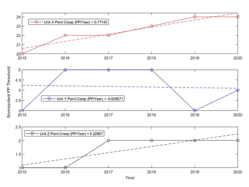
This more focused phase of my analysis proved to be consistent in my earlier, larger view, supporting the presence of point creep in these ranges of preference points. Specifically, Unit X (red) was examined in the 19 and more preference point range and demonstrated a similar steep creep illustrated in Figure 2; Unit Y (blue) was examined in the 4-10 point range and demonstrated a similar flat trend as shown in Figure 2; and Unit Z (black) was examined in the 0-3 point range and showed a consistent gradual creep like in Figure 2. This correlation is consistent with the total nonresident population and warrants further exploration, but it should also be noted that the sample size used in this initial examination is quite small and has not yet proven to be applicable to a larger data set.
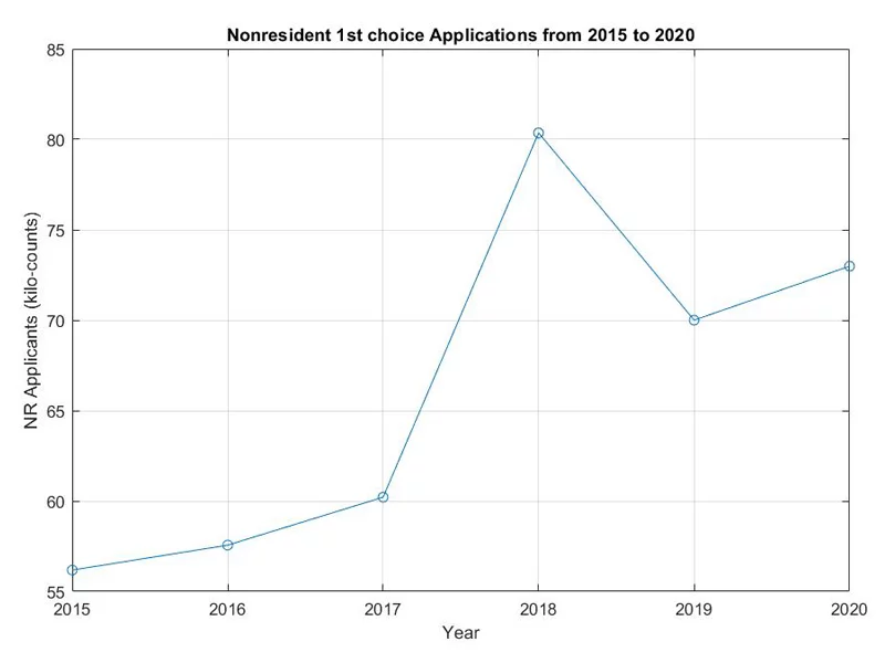
To wrap up the analysis, I wanted to look closer at the trends that may be present in the total number of nonresident mule deer applications regardless of preference point (see Figure 4). What I found is that the number of applicants each year is increasing, resulting in a higher number of hunters competing for a consistently limited number of tags. However, an outlier in my examined years (2015 to 2020) is clearly plotted in 2018 with a sharper increase than one would expect. This increase has a direct correlation with the reformation of Colorado’s application and preference point fee structures that year. In a nutshell, the fees were lower that year so the barrier to entry was lower, resulting in the spike in applicants. Fortunately, Colorado addressed this issue before the following application season, and the spiked dropped off. However, the upward trend in applications over the long term continues.
What This Means for Western Hunters
Point creep is definitely real for nonresident mule deer hunters in the state of Colorado. This is clearly shown in Figure 2 in the preference point regions mentioned. The data also showed that the point creep trends in the total nonresident pool manifest at the unit-specific level. Colorado applicants trying to decide on a mule deer tag to draw should consider looking at hunts that take just over 4 preference points if they want to better predict point creep. According to the data, this would avoid the proverbial point creep and allow the chance at drawing the same tag multiple times. This strategy would place the application beyond the 0-3 point creep region but less than the nonresident quota reduction threshold.
The nonresident quota cap in Colorado is currently 35% on units that take less than 6 points for residents to draw, but 20% for units that take 6 points or more. The nonresident quota might carry the most weight in terms of point creep for drawing tags for nonresidents. It could arguably be the biggest factor to consider as a nonresident when looking at the historical data of the total nonresident applications (see Figure 4). Since 2015, nonresident applicants have increased by ~30% (~20,000 applicants). That inflation alone is going to fuel point creep, specifically among nonresidents. On top of that, the Colorado Parks & Wildlife appears to continue to lower population carrying capacities in some Data Analysis Units, which largely governs tag quotas.
Where Do We Go From Here?
The data paints a fairly gloomy picture for nonresident hunters looking to build points for the future. I showed from the data in the last 6 years:
- Point creep is only prevalent in certain preference point regions
- Point creep trends are apparent at the unit-level
- Total applications are trending upward
After finding these preference point trends in the data, I find it unfavorable to build points for a once-in-a-lifetime type of tag as a nonresident; it might never happen. On top of the discoveries I outlined in this article, the list of additional arguments against building points is a lengthy one (to name a few):
- Increasing resident population
- Reductions in mule deer carrying capacities
- Reintroduction of gray wolves
- New 5-year season structure to reduce CWD
- Colorado B&C entries trending down from hard winters, noted by M. Duplan (Colorado B&C Entries)
Conclusion
I gained a lot of knowledge and validation about point creep from this study. It has helped shape my preference point strategies going forward. And I hope that it can help your strategy wherever you sit on the preference point distribution. This study was specific to nonresident mule deer in Colorado, but this analysis could easily be expanded to other Western states and species.
Comment on this article or ask Mike questions here.
*All data was collected from Colorado Parks & Wildlife


